How to Build a Review Landing Page That Actually Works

In the hospitality world, every guest interaction is an opportunity. But how do you capture that feedback consistently and turn it into fuel for growth? The single most powerful tool for the job is a dedicated review landing page. This isn't just another contact form; it's a strategic hub designed to turn every customer's experience into a predictable stream of valuable reviews, helping you collect smarter, act faster, and grow stronger.
Your Hidden Growth Engine: Why a Review Landing Page Is a Must-Have
As a busy owner, you can't afford to leave your reputation to chance. Hoping customers find you on Google or TripAdvisor is a passive strategy that leaves growth on the table. A review landing page puts you firmly in control of the entire feedback process.
Think of it as the central nervous system for your online reputation. It’s the one place where every QR code scan, email link, and SMS prompt leads. This creates a consistent, reliable channel for guest insights that does more than just gather comments—it actively shapes your online presence, turning feedback into your most valuable business asset.
Taking Control of Your Online Reputation
At its core, a review landing page streamlines the customer's journey to leaving feedback. Instead of making them navigate the web on their own, you give them a simple, branded, and frictionless path. This simple step has two huge benefits:
For happy customers: You guide them straight to high-impact public review sites like Google, Yelp, or TripAdvisor. This boosts your ratings where they matter most.
For unhappy customers: You offer a private feedback channel first. This gives them a space to voice their concerns directly to you, preventing a bad experience from immediately becoming a public one-star review.
This strategic filtering is the first step to collecting feedback smarter. You amplify the positive voices while creating a chance for immediate service recovery with guests who had a less-than-perfect experience. It's about turning every piece of feedback into an opportunity to improve.
A well-structured review landing page is more than a tool—it's a proactive reputation management system. It ensures you're not just reacting to public feedback but actively shaping the conversation around your brand.
The real power here comes from understanding how reviews affect Local Search Engine Optimisation. A steady flow of fresh, positive reviews signals to search engines that your business is relevant and trusted. That directly impacts how visible you are to potential new customers. This is how you act faster on feedback to grow stronger.
The Anatomy of a High-Converting Review Landing Page
So, what separates a review page that gets results from one that just gets ignored? The difference is simpler than you think. It comes down to a few key ingredients working together to create a seamless experience for your customer. To build something truly effective, you first have to understand what is a good landing page in the first place.
Think of your page like a friendly host guiding a guest into a room. It should be welcoming, direct, and make the next step totally obvious. Your goal is to remove every bit of friction, turning the act of leaving feedback from a chore into a natural, easy step.
Crafting a Clear and Compelling Welcome
The first few seconds a customer spends on your page are everything. You have to immediately answer their unspoken question: "What's in it for me, and why should I bother?"
Your page absolutely must have:
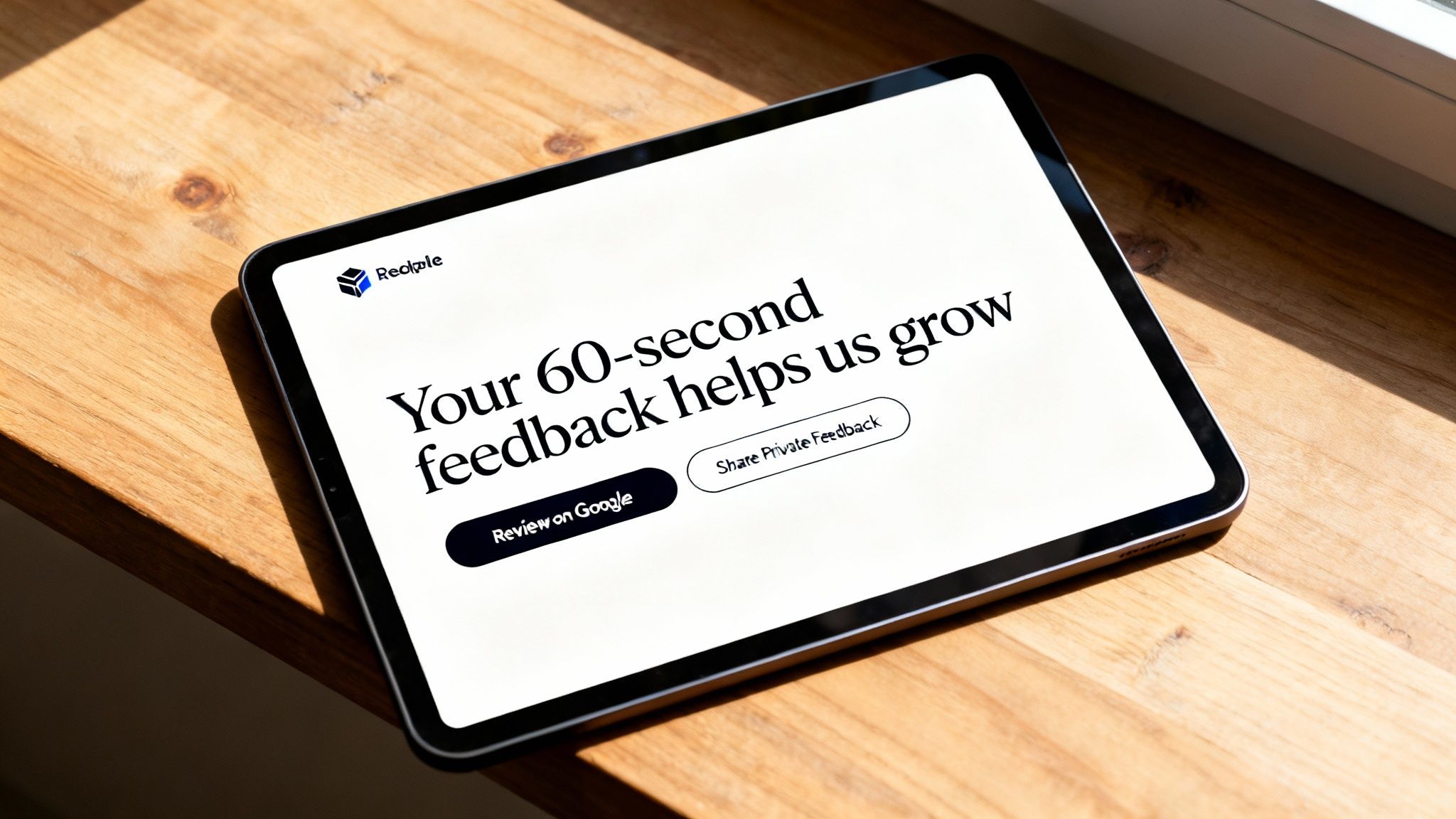
A Powerful Headline: Don't settle for "Leave a Review." Try something that shows value, like, "Help Us Improve in 60 Seconds" or "Share Your Feedback & Shape Our Future." This tells them their time is respected and their opinion has an impact.
A Clear Value Proposition: Briefly explain why their feedback matters. A simple sub-headline like, "Your thoughts help us serve you better on your next visit," connects their action to a direct benefit for them.
Strong Brand Identity: Your logo, colors, and fonts need to be consistent with the rest of your business. This builds instant trust and reassures customers they're in the right place, preventing them from bouncing.
These elements work in concert to create an environment where the customer feels valued and understood, making them far more likely to share their thoughts.
Designing a Frictionless Path to Feedback
Once you've got their attention, the next job is to make the process ridiculously simple. Overwhelming customers with too many choices or a confusing layout is the fastest way to lose their feedback for good.
This is where the psychology of choice comes in. By offering clear, distinct pathways, you empower the customer and send completion rates soaring. A high-converting review page always includes:
A Simple Sorting Mechanism: Kick things off with a straightforward question like, "How was your experience?" This first simple step helps guide the user down the right path without making them think too hard.
Clear Calls-to-Action (CTAs): Use large, easy-to-tap buttons with explicit labels. For example, "Review Us on Google" for happy customers and "Share Private Feedback" for those with concerns.
Minimal Distractions: Get rid of all unnecessary links, navigation menus, or pop-ups. This page has one job and one job only: to capture that review.
By designing the experience this way, you're not just asking for feedback; you're building a feedback engine that practically runs itself. This lets you collect smarter and build a much stronger business.
To see the difference in action, here’s a breakdown of what separates a basic page from one designed to perform.
Key Elements for a High-Converting Review Page
Element | Standard Approach (Low Conversion) | Optimized Approach (High Conversion) |
|---|---|---|
Headline | Generic text like "Write a Review." | Benefit-driven: "Help Us Improve in 60 Seconds." |
Value Proposition | Missing or vague. | Clear and concise: "Your feedback helps us get better." |
Call-to-Action (CTA) | A single, generic "Submit" button. | Two distinct paths: "Review on Google" vs. "Private Feedback." |
Branding | Inconsistent colors, no logo. | Uses company logo, colors, and fonts for trust. |
User Flow | Asks for all information at once. | Starts with a simple rating (e.g., stars) to segment users. |
Mobile Experience | Not optimized; hard to tap buttons. | Fully responsive with large, finger-friendly CTAs. |
Distractions | Includes site navigation, footer links. | A focused page with no exit links or extra menus. |
As you can see, the optimized approach isn't about adding more stuff—it's about removing friction and adding clarity at every step. Each element is intentionally designed to make the user's decision as easy as possible.
Designing for Mobile-First Feedback Collection
Let's be real: the modern customer journey happens on a phone. The moment someone decides to leave you a review, they’re almost certainly reaching for their mobile device, often while still inside your business.
If your review landing page isn't built for that exact moment, you're losing valuable feedback. A mobile-first design isn't a "nice-to-have" anymore; it's non-negotiable. It means engineering an experience that is fast, simple, and intuitive on a small screen, prioritizing what matters most to an on-the-go user: speed and clarity. Every extra second of load time or moment of confusion is an exit ramp.
The Non-Negotiables of Mobile UX
To capture feedback effectively on mobile, your landing page must be built on a foundation of speed and simplicity. There’s no room for error when a customer is giving you their time.
Here are the core principles to live by:
Lightning-Fast Load Times: Your page has to load in under two seconds. Anything longer, and you'll see a massive drop-off in submissions.
Single-Column Layout: Keep everything in one clean, scrollable column. This stops any awkward pinching and zooming, making the page easy to fly through with one hand.
Large, Tap-Friendly Buttons: Make sure your calls-to-action are big, bold, and have plenty of breathing room. Frustratingly small buttons are a guaranteed way to lose a review.
Minimal Form Fields: Only ask for what is absolutely essential. The fewer fields a customer has to fill out, the higher your completion rate will be.
Your technology should never be a barrier to a customer's willingness to share their thoughts. A frictionless mobile experience shows you respect their time, which in turn encourages them to give you their feedback.
Optimizing for Speed and Channel
Data on landing page performance paints a clear picture: speed and the right delivery channel are everything. While mobile visitors can sometimes be less likely to convert than desktop users, a blazing-fast page helps close that gap significantly.
At the same time, how you deliver your review link matters. Sending your review landing page link via email is a standout strategy, with email-driven visitors converting 77% more than those from paid search. You can find more insights on landing page conversion benchmarks from Withsurface.com.
This is why a holistic approach is so important. Using a feature like FeedbackRobot's Prompt to Survey automatically sends an email or SMS at the perfect moment—like right after a guest checks out of your hotel via your Mews integration—delivering your mobile-optimized page through the highest-converting channel. This combination of smart automation and thoughtful design is how you collect smarter and build a reliable stream of customer feedback.
How to Automate Your Entire Feedback Workflow
A brilliant review landing page is your front door for feedback, but what happens once a customer steps inside? Manually sorting every review, spotting trends, and responding to issues is a full-time job you don't have time for.
This is where you move from just collecting feedback to actively using it to grow. By hooking your landing page into a Feedback Operating System, you create a workflow that runs 24/7. It's the difference between a dusty suggestion box and a direct line from your customers to your operations team. This is how you stop being a feedback collector and start being a problem solver in real-time.
Triggering Feedback Requests at the Perfect Moment
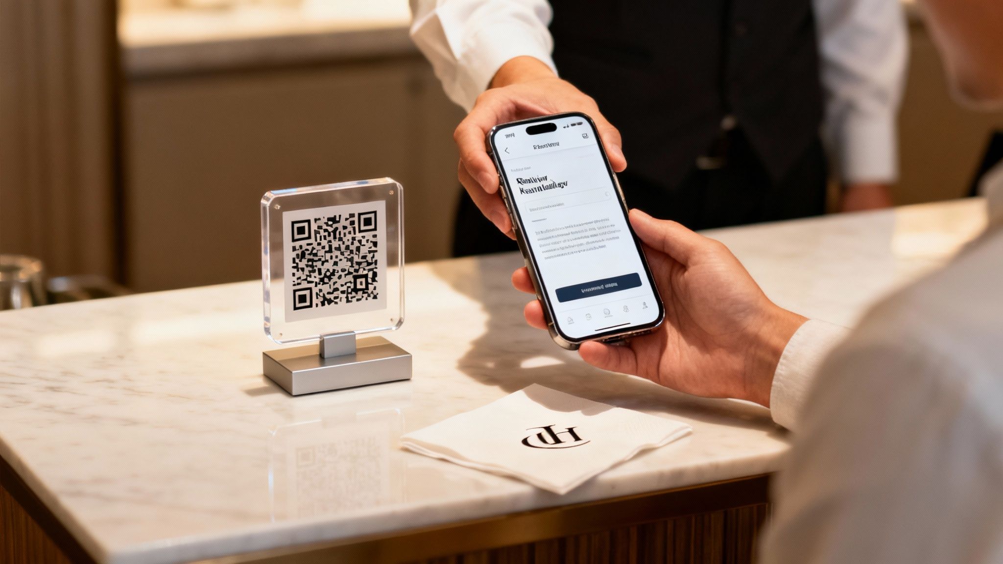
Timing is everything. Ask a hotel guest for a review a week after they check out, and the moment is gone. The trick is to make the request a natural final step in their experience.
This is where Prompt to Survey comes in. This feature acts as your automated outreach engine, plugging directly into the systems you already use, like your Mews property management system or your Toast POS. When a guest checks out or a customer closes their tab, the system automatically fires off a personalized review request via email or SMS.
For a hotel: A guest finalizes their stay in Mews, and an email with a link to your review page lands in their inbox moments later.
For a restaurant: A diner pays their bill using Toast, and a quick text invites them to share their thoughts while the meal is still fresh in their mind.
This automation means you're always asking the right person at the right time, dramatically boosting your submission rates.
From Raw Comments to Instant Insights
Reading every single customer comment is impossible as you grow. You need to see the bigger picture instantly to catch recurring problems or identify what’s working.
As soon as feedback hits your system, our AI Summaries get to work. This feature provides instant insights and sentiment analysis, scanning every comment to identify key topics and overall mood. Instead of drowning in hundreds of words, you get a clean summary of what actually matters.
For example, the AI might flag that 73% of recent comments mention "slow service," or that positive feedback consistently praises a specific menu item. This gives you an at-a-glance pulse check so you can act faster without getting bogged down in the details.
If you want to go deeper on this, check out our guide on the benefits of using an automated survey builder.
Turning Negative Experiences into Lasting Loyalty
A negative review isn't the end of the world—it's a golden opportunity. When you handle a complaint the right way, you can turn an unhappy customer into one of your most loyal advocates.
Our Resolutions Engine automates this crucial service recovery process. This feature is your tool for automated service recovery, triggering a pre-set workflow the moment negative feedback is detected to make things right.
For example, if a customer leaves a one-star rating, the Resolutions Engine can instantly send a personalized apology from the manager, log a ticket for your team to follow up, and even include a 15% discount for their next visit.
This simple step turns a potential one-star public blow-up into a private conversation. It shows you're listening, you care, and you’re committed to fixing it. This is how you grow stronger—by turning detractors into your biggest fans.
Boosting Submissions with Smart Optimization Tactics
A great review landing page doesn’t just exist—it evolves. To maximize the number of submissions you get, you need to treat your page like a living tool that can be fine-tuned for peak performance. This is where Conversion Rate Optimization (CRO) comes in.
Think of it like adjusting the recipe for your most popular dish. A little tweak here, a small adjustment there, and suddenly something good becomes unforgettable. By systematically testing different elements, you stop guessing and start knowing what truly motivates your customers to share their thoughts.
Fine-Tuning Your Feedback Engine
The best way to improve your page is to listen to your user data. A/B testing is your best friend here. It’s a simple concept: create two versions of your page, show them to different segments of your audience, and see which one performs better.
You can test almost anything, but for the biggest impact, start here:
Headlines: Pit a benefit-driven headline like "Help Us Improve" against a time-based one like "Share Your Feedback in 60 Seconds."
Calls-to-Action (CTAs): Does "Leave a Review" work better than "Share Your Experience"? Tiny wording changes can have a huge impact.
Button Colors: Experiment with contrasting colors that make your submission button impossible to miss. A simple color change can draw the eye and guide the user's next step.
The goal is to get out of the guessing game. Each test gives you a clear winner, allowing you to collect smarter by continuously improving your submission process.
Minor design and messaging choices can swing performance by triple digits. Your review landing page is a powerful conversion tool, but only if you optimize it with the same care you give your menu or your room rates.
Data from wide-ranging studies backs this up. While the average landing page converts at around 6.6%, simple personalization can blow that number out of the water. Personalized CTAs, for instance, convert a staggering 42–202% better than generic ones. Even just addressing customer concerns upfront on the page can boost submissions by up to 80%. You can learn more about these powerful landing page performance statistics from Hostinger.com.
Building Trust to Reduce Friction
Beyond A/B testing, another powerful optimization tactic is simply building trust. When customers feel secure and respected, they’re far more likely to complete the feedback process. One of the easiest ways to do this is by setting clear expectations.
Just adding a small line of text like, "This will only take two minutes," can dramatically reduce how many people abandon the page. It removes the fear of getting stuck in a long, complicated survey and signals that you value your customer's time. This simple act of transparency builds the trust you need to turn a visitor into a reviewer.
Once you have that great feedback, you can get more mileage from it by learning how to share your best reviews on social media.
Unifying Your Feedback into a Single Dashboard
Your review landing page is a great front door for collecting direct feedback. But the conversation about your business is happening everywhere—on Google, TripAdvisor, Yelp, and dozens of other sites. Trying to keep up is a logistical nightmare.
To really know how you're doing, you need a single source of truth. Without that 360-degree view, you’re only catching bits and pieces of the story, making it impossible to spot critical trends before they get out of hand. This is where you connect your collection efforts to a central command center.
Achieving a 360-Degree Customer View
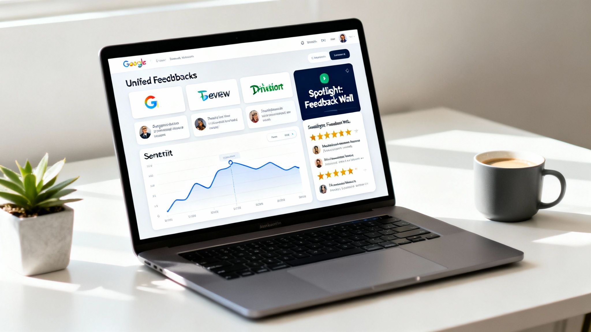
Imagine seeing every piece of feedback, from every source, all in one place. That's exactly what our Radar feature does. Think of Radar as your unified review intelligence dashboard—it pulls in feedback from your landing page and mashes it up with public reviews from across the web.
Instead of jumping between a half-dozen accounts, you get one clean dashboard showing your entire reputation. You can instantly see how your different locations stack up against each other and pinpoint exactly where your team is knocking it out of the park or where they might need a little help.
This unified approach stops you from just reacting to individual comments. It empowers you to make strategic, data-driven decisions based on the complete customer story.
By pulling everything together, you finally get the full context of your customer experience. Our guide to finding the right customer experience dashboard software digs deeper into why this centralized view is so crucial for modern hospitality businesses.
Turning Positive Reviews into Powerful Social Proof
Once you've collected all those great reviews, don't just let them sit there. Positive feedback is one of your most valuable marketing assets, and it's time to put it to work. Social proof builds trust with potential customers long before they ever walk through your door.
This is exactly why we created our new Spotlight: Feedback Wall. This tool automatically gathers your best reviews and turns them into a beautiful, shareable widget that you can embed right on your website.
It acts as a live feed of testimonials, showcasing authentic praise from real customers. This transparent display of happy experiences reinforces your reputation and gives new visitors the confidence they need to make a booking. It’s the final, crucial step in the feedback loop: collect smarter, act faster, and leverage your hard-earned reputation to grow stronger.
The review visualizer tool turns testimonials into branded social images — no design work needed.
Still Have Questions? Let's Clear a Few Things Up
Here are some of the most common questions we hear from hospitality and service owners about building and using a review landing page. Let's get you clear, practical answers so you can get started.
What's the Real Point of a Review Landing Page?
Think of it as a central hub for all customer feedback. Its main job is to give customers one simple, controlled place to share their thoughts. This makes the process dead simple for them, which means you get more reviews. More importantly, it lets you guide happy customers to public sites like Google while pulling negative feedback aside for you to handle privately.
How Do I Actually Get Customers to Use the Page?
The best way is to ask them right after their experience. We've found that automated prompts sent by email or SMS after a purchase or visit work wonders.
This is exactly what FeedbackRobot's Prompt to Survey feature does. It hooks directly into the systems you're already using, like Mews or Toast, to send the ask at the perfect time. Another great trick? Put QR codes on tables, receipts, or signs to capture feedback while your customers are still on-site.
A great landing page is only effective if customers see it. Automating the ask at the perfect moment—right after a great experience—is the key to a high submission rate.
Should I Really Send Unhappy Customers to a Different Place?
Absolutely. This is the secret sauce. A smart review landing page starts with a simple screening question.
If a customer is happy, they get sent straight to public review sites like Google. But if they're unhappy, they're routed to a private feedback form. This lets you jump on the problem and solve it using our Resolutions Engine before they feel the need to post a negative review for the world to see.
Ready to stop reacting to feedback and start using it to grow? FeedbackRobot gives you the tools to collect smarter, act faster, and build a stronger reputation. Launch your IT Support Provider User Feedback Tool.
Tired of posting boring screenshots of Google Reviews? Use our free IT Support Provider Review Visualizer to create high-impact graphics for Instagram and LinkedIn. Create Yours Now →
What is the primary goal of a review landing page?
To act as a 'Trust Bridge.' It provides a central hub where potential customers can see your aggregated ratings from across the web, proving your consistency and authority in your local market.
How does a review landing page help with SEO?
By using schema markup (Review Snippets), you can get your star ratings to appear directly in Google Search results, which can increase your click-through rate (CTR) by up to 35%.
Should I link to my Google Business Profile from this page?
Yes. A review landing page should make it incredibly easy for a customer to verify your reviews on third-party sites, as this transparency is a major trust signal for modern consumers.
Can I use this page to collect *new* reviews?
Absolutely. A well-designed review page should have a prominent 'Leave a Review' button, routing guests to their preferred platform (Google, Yelp, Facebook) with a single click.
What is the ROI of a dedicated review landing page?
The ROI is seen in 'Conversion Rate Optimization.' When potential guests arrive at your site and see a professional, verified wall of praise, they are far more likely to book a table or stay.